From Research Recommendation to Clickable Mockup
For most of my career, the best thing I could hand a team was an annotated sketch of a recommendation. A deck, a readout, a confident "here's what I'd do next." And I can draw. But I lost count of how many recommendations got reinterpreted, deprioritized, or disappeared somewhere between my slides and someone else's roadmap.
The goalpost has moved. We're no longer being asked only to describe the better idea. We're being asked to show it. The thing standing between a research recommendation and a better idea was never the building. It was knowing what's worth building in the first place. That's the work researchers have always done.
So now instead of recommending the thing, you can build a version of it. A short video that walks someone through the experience. A clickable mockup they can actually move through. A simple working version that stakeholders can touch and interact with.
Same craft we've always practiced, just expressed in a new medium.
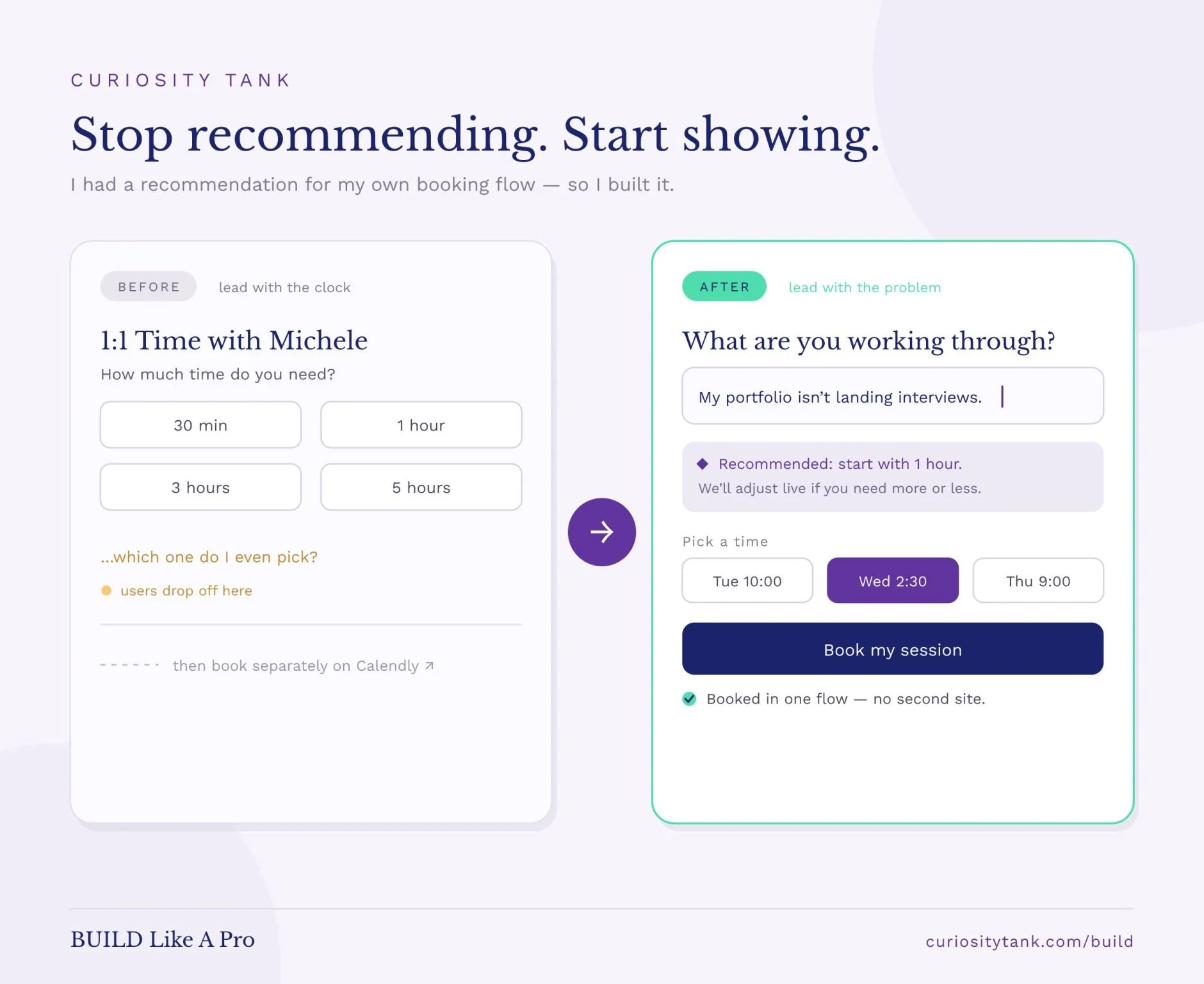
Case in point: the before-and-after above is my own booking page. People kept stalling on the very first question, 'how much time do I need?' Even I can't answer that for them. So instead of just writing 'lead with the problem,' I rebuilt the flow that way.
That's the fuel and the inspiration behind my new workshop, BUILD Like A Pro. Three hours, live and online, where you'll leave having turned a recommendation into something you can actually show. Not theory, not someone else's case study. Your work, built.
It's a small founding pilot, eight seats, $147, and I'm running it twice so you can choose what works for you:
Tuesday, June 2 · 3–6pm PT
Thursday, June 4 · 9am–12pm PT
Researchers, what's the one recommendation you wish you could have simply shown someone, instead of advocating for three months?