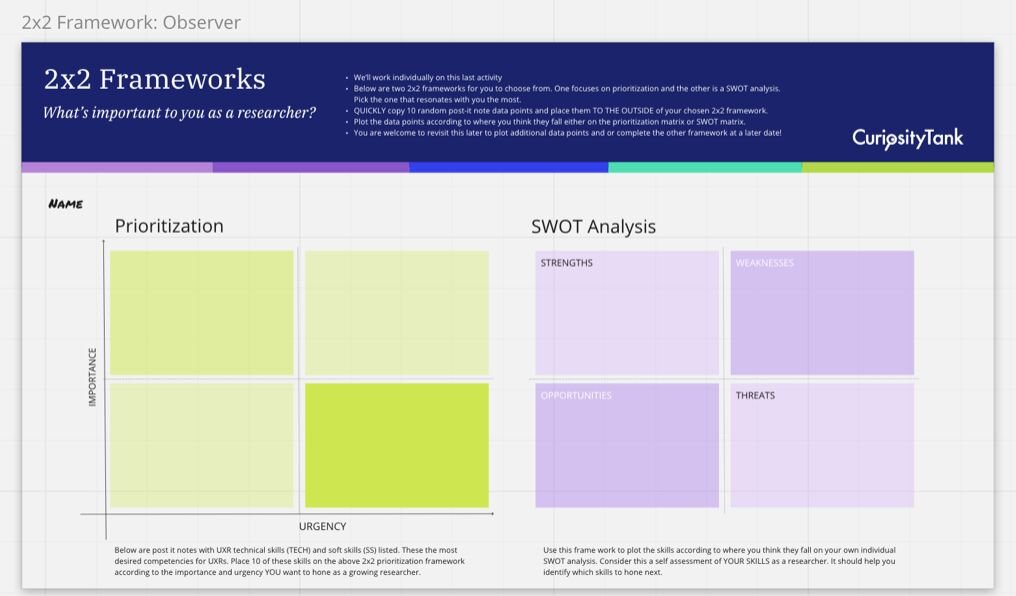
Use 2x2 frameworks to see the data

Last week we completed the second part of our "Spot Patterns" user research workshop. We reviewed the thematic analysis homework activity and the many different approaches registrants took to accomplish it. Beautiful minds!
We “watched” and discussed thematic analysis in Trello, Airtable, and Dovetail, then got hands-on in Miro for real-time affinity mapping!
I love seeing the cohort in Miro and their cursors wizzing around! I love sharing the reactions from our first time Miro users. “OHHH! This is soooo fun!!!!!”
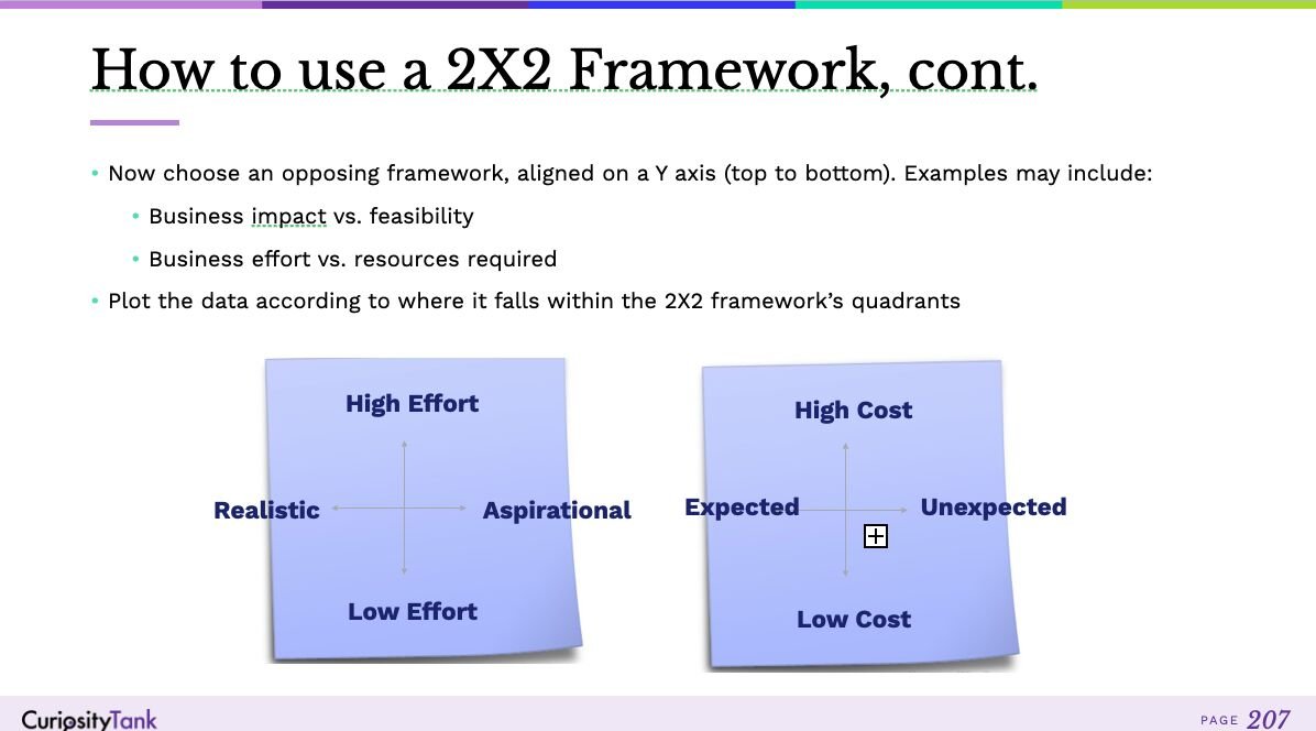
After three waves of affinitizing our data, we plotted it into 2x2 frameworks, plotting opposing characteristics on a spectrum according to where it falls along each spectrum.
In other words, we plot a single spectrum theme along an X-axis (left to right) e.g. a spectrum of feelings or wishlist requests. On the Y-axis (top to bottom), we plot according to, say, feasibility or amount of effort to implement.
Effort versus impact is a terrific way to access priorities. Urgency versus importance is another really actionable framework.
2X2s allow us to “see the data” directly in relation to our actual product and service development needs. These visualizations help us ascertain how to make more informed decisions with confidence.
We also talk about Mindmapping, Stop Light graphing, and data triangulation (using multiple data sources to strengthen our research questions and insights).
This is definitely one of my all-time favorite workshops!